How to build a dynamic dashboard and stay on top of your KPIs

If a picture can paint a thousand words, how many is a dynamic picture worth? A lot of words, according to business owners, sales and purchasing professionals who use dynamic dashboards regularly.
Among the biggest challenges for business managers is wading through the massive amount of information generated across the entire company. Smart companies bolt-on business intelligence software to their ERP which syncs all the data into a single source of truth.
Business intelligence software such as Phocas, helps users uncover the data insights that drives their business and present the findings in dashboards, that can be easily built to meet the needs of your business.
Building dashboards
You don’t need to be technical to create a powerful dashboard in Phocas.
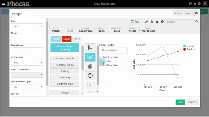
To build a dashboard in Phocas, you simply go into the dashboard area, name it and get started. You fill the dashboard by using widgets, these clever tools are the conduits to your data in the Phocas database. By clicking on the widget function, you are able to select from a number of in-built queries you may want to include in your dashboard. (e.g. Year to Date Sales Summary or Rolling 12 Month Sales by Customer Type). Once you select from hundreds of options, you then choose whether you want it displayed as a chart or graph and save.
You can create as many dashboards as you like, customize them and share them with other users. There are a number of ways to change the look and feel of a dashboard. Most of this customization can be done either while you are building a dashboard, or with an existing dashboard.
You can set your dashboard to update with any new data, either immediately or at selected intervals.
To view how simple it is to create a dashboard, view the video below.

Using dynamic and interactive dashboards
A variance catches your attention in the dashboard and you want to follow your train of thought, so you drill down into the underlying information to find out what is driving what you are seeing on the surface.
To make the dashboard ‘come alive’, you open the dashboard in Phocas that you are reviewing, maybe it is the Sales Dashboard which includes key metrics such as Current vs Previous Period Sales , Sales Pipeline, No Sales, Average Deal Size, Forecast Accuracy.
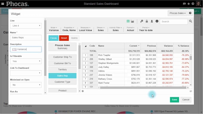
You decide that you want to see all the above metrics by a particular Sales Representative in the business, so you do this by adding a new widget and making it selectable. You go back to widgets, and then find the Sale Representative dimensions and add this. You can now view all the metrics from the perspective of each Sales Rep and send them specific recommendations directly to their email, so they can take immediate action.
To make your dashboard dynamic watch this video:

Information is power. With real-time access to the exact data you need, you make the best strategic, tactical, and operational decisions.

Empowering businesses with intuitive data analytics, driving informed decisions for growth and profitability. We make people feel good about data.

How to prepare professional board reports
Preparing effective board reports cannot be underestimated in the ever-changing and dynamic business world. They’re not only essential for communicating financial performance and operational progress, but they’re also an all-important part of strategic and intelligent decision-making.
Read more
What is sales and operations planning (S&OP)
Sales and operational planning (S&OP) helps businesses to align their strategic goals with day-to-day operations. By integrating financial planning with operational and sales planning, S&OP ensures that all departments work cohesively towards common objectives. This process operates on strategic and tactical levels, providing insights that influence long-term decisions while guiding day-to-day actions. Understanding the dual focus of S&OP is essential for creating a robust plan that addresses immediate needs while positioning the company for future success.
Read more
How connected planning software helps your strategy succeed
How many strategy days have you been on? Leaders often go offsite so they can think laterally and not be disturbed. So much emphasis is placed on strategy that the implementation of strategic business planning gets overlooked. This is often the case if the strategy is not linked to the budget or resources are not distributed correctly. One of the key reasons strategies don’t work is because business leaders don’t review the implementation or business performance frequently enough. Where does your business sit with monitoring the success of your strategy?
Read more
What is Integrated Business Planning (IBP)?
Imagine a soccer team, where each player operates independently, unaware of their teammates' actions and strategies. The forward charges ahead without knowing where the midfielders are, while the defenders are left guessing the goalkeeper's next move. Chaos ensues, and the likelihood of winning plummets. In contrast, a well-coordinated team, communicating effectively, and working towards a common goal, significantly increases its chances of success. This analogy mirrors the concept of Integrated Business Planning (IBP) in a business context. Just as a successful soccer team requires cohesive strategy and communication, a business thrives when its departments are aligned and collaborative.
Read more
Find out how our platform gives you the visibility you need to get more done.
Get your demo today

